Keystone Interface
29 April 2020
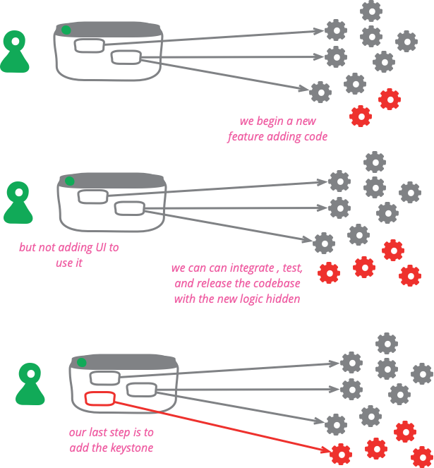
Software development teams find life can be much easier if they integrate their work as often as they can. They also find it valuable to release frequently into production. But teams don't want to expose half-developed features to their users. A useful technique to deal with this tension is to build all the back-end code, integrate, but don't build the user-interface. The feature can be integrated and tested, but the UI is held back until the end until, like a keystone, it's added to complete the feature, revealing it to the users.
A simple example of this technique might be to give a customer the option of a rush order. Such an order needs to be priced, depending on where the customer lives and what delivery companies operate there. The nature of the goods involved affects the picking approach used in the warehouse. Certain customers may qualify to have rush orders available to them, which may also depend on the delivery location, the time of year, and the kind of goods ordered.
All in all that's a fair bit of business logic, particularly since it will involve gnarly integration with various warehousing, catalog, and customer service systems. Doing this could take several weeks, while other features, need to be released every few days. But as far as the user is concerned, a rush order is just a check-box on the order form.
To build this using the check-box as the keystone, the team does development work on the underlying business logic and interfaces to internal systems over the course of several production releases. The user is unaware of all this latent code. Only with the last step does the keystone check-box need to be made visible, which can be done in a relatively short time. This way all latent code can be integrated and be part of the system going into production, reducing the problems that come with a long-lived feature branch.

The latent code does need to be tested to the same degree of confidence that it would be if it were active. This can be done providing the architecture of the system is setup so that most testing isn't done through the user interface. Unit Tests and other lower layers of the Test Pyramid should be easy to run this way. Even Broad Stack Tests can be run providing there is a mechanism to make them Subcutaneous Tests. In some cases there will a significant amount of behavior within the UI itself, but this can also be tested if the design allows the visible UI to be a Humble Object.
Not all applications are built in such a way that they can be extensively tested in a subcutaneous manner - but the effort required to do this is worthwhile even without the capability to use a keystone. Tests running through the UI are always more trouble to setup, even with the best tools to automate the process. Moving more tests to subcutaneous and lower level tests, especially unit tests, can dramatically speed up Deployment Pipelines and enable Continuous Delivery.
Of course, most UIs will be more than a check-box, although often they aren't that much more work to keystone. In a web app, a complex feature will often be an independent web page, that can be built and tested in full, and the keystone is merely a link. A desktop may have several screens where the keystone is the menu-item to make them visible.
That said, there are cases when the UI can't be packaged into a simple keystone. When that's the case then it's time to use Feature Flags. Even in this case, however, thinking of a keystone can be useful by ensuring that the feature toggle only applies to the UI. This avoids scattering lots of toggle points through the back end code, reduces the complexity of applying the toggle, allows the use of simple toggle mechanisms, and makes it easier to remove when the time comes.
There is a general danger with developing a UI last, in that the back-end code may be designed in a way that doesn't work with the UI once it's built, or the UI isn't given the attention it needs until late, leading to a lack of iteration and a poor user experience. For those reasons a keystone approach works best within an overall approach that encourages building a product through thin vertical slices that lead to releasing small but fully working features rapidly.
I've used the example of a user-interface here, but of course the same approach can be used with any other interface, such as an API. By building the consumer's interface last, and keeping it simple, we can build and integrate even large features in small chunks.
Dark Launching is a variation where the new feature is called once its built, but no results are shown to the user. This is done to measure the impact on the back-end systems, which is useful for some changes. Once all is good, we can add the keystone.
Acknowledgements
I first came across the metaphor of a keystone for this technique in the second edition of Kent Beck's Extreme Programming Explained. Pete Hodgson, Brandon Duff, and Stefan Smith reminded me that I'd forgotten this.
Dave Farley, Paul Hammant, and Pete Hodgson commented on drafts on this post.

